Junior Graphic Designer
Based in London, UK
Open for commison

marquee magazine
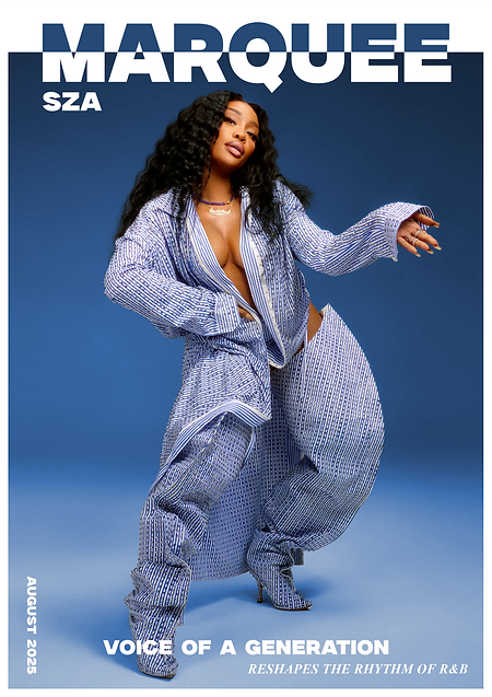
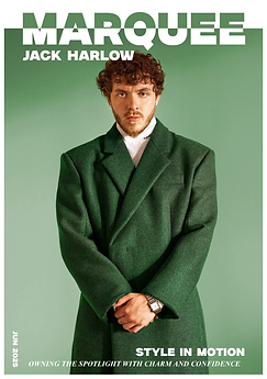
Marquee is a conceptual consumer magazine spotlighting rising global artists. Inspired by the aspirational tone of Vogue, I developed the masthead, cover lines, and editorial spreads to create a luxury yet trend-focused brand.
typeface exploration
I enjoyed working with all four fonts in my exploration, as each brought something different to the magazine’s visual identity. The serif fonts I considered — Times New Roman and Minion Variable Concept — had an elegant and sophisticated quality, perfect for conveying a more premium, traditional feel.
However, when placed over different coloured backgrounds, their finer details felt thinner and the impact of the typeface was often lost. This led me to experiment more with sans serif options, as they offered a stronger, more confident presence.
Among these, Newake stood out with its softer edges and distinctive diagonal forms, giving it a friendly and approachable tone. Although, Milker had a bolder, blockier structure with straight lines that carried more weight and authority. Its clarity and strength was the deciding factor as it looked more appealing for headlines and design elements where visual impact was essential.
visual direction
I am particularly drawn to visually led magazines that prioritise strong imagery over large amounts of text. This approach creates a clean, modern, and minimal aesthetic that feels both sophisticated and impactful.
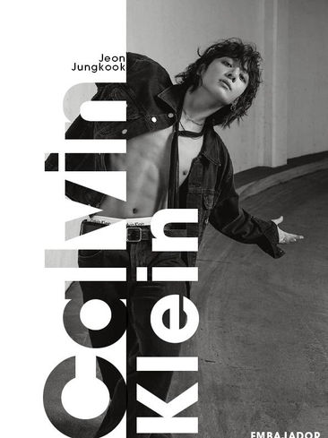
In my research, I studied covers from Vogue, Esquire, GQ, and Time, all of which demonstrate how bold photography paired with carefully restrained typography can create confident and timeless editorial design.
These examples have influenced my own approach, as I aim to apply the same balance of clarity and visual strength within my work.
The gallery on the right highlights these references and illustrates how minimal text can enhance, rather than compete with, powerful imagery.


page-spreads
I designed a series of double-page magazine spreads that showcase SZA’s cultural impact and creative ventures in 2025. Each spread was carefully considered as part of a larger visual system, ensuring a cohesive design language across the project while still allowing space for variation in headline treatments, typography, and image placement.
This balance created continuity from page to page without sacrificing individuality, keeping the layouts engaging and dynamic. I paid close attention to visual hierarchy, grid structure, and the relationship between negative space and imagery, using these elements to guide the reader’s eye naturally through each composition. This not only reinforced clarity but also gave the spreads a sense of authority.
The creative direction was strongly influenced by research into leading publications such as Vogue, Esquire, and GQ.
Their minimal use of typography, disciplined layouts, and emphasis on powerful imagery was the standard I wanted to work towards and implement for myself.


self-reflection
Overall, I believe this project was very successful, and I particularly enjoyed the process of researching and experimenting with different imagery. I am pleased with the typeface choices and the distinctive masthead, as well as the visual freedom I was able to bring to the magazine. Rather than following the format of a traditional, text-heavy publication, I chose a more visually driven layout.
This decision came from two influences: my appreciation for minimalist design—where elements have room to breathe and stand out with clarity—and the reality of today’s fast-paced digital culture, where information is consumed quickly and design is often cleaner and more streamlined.
I also feel the mockups I used presented my work to a high standard, showcasing the spreads in a professional and engaging way.
The three double-page layouts maintained a strong sense of continuity through consistent type and imagery while keeping the content fresh and relevant. I believe the result was clean, cohesive, and reflective of current editorial trends.
If I were to develop the project further, I would experiment more with the overall visual direction of the front covers. Pushing myself to be more adventurous and experimental in this area could have taken the design to another level and allowed me to explore even bolder creative possibilities.

2025

2025

2025

2025
Nyle Savon Portfolio © 2025 . All rights reserved. For direct contact, email : Nylesavon@hotmail.com


